Business Support Network – Mediavuk – the media consultants

After more than 10 years we have decided to go new ways. Nevertheless, we leave this website active simply for us and our customer as a reminder. From now on we are Base4and want to climb new peaks with you.
Life is exciting.

Business Support Network

Business Support Network was formed by the managers and consultants who have worked for years for various business associations in Serbia and private sector companies. The mission of the BSN is to provide complete services to investors, from pre-investment analysis and market research to the everyday legal, consultative, organizational, marketing and lobbying support. The network provides a service to local companies to connect with strategic partners in the EU, especially in German-speak countries.

  • BRANDING
  • WEBSITE DESIGN
  • IOS PROGRAMMING
  • APP DESIGN
  • IMAGE PROCESSING
  • SOCIAL MEDIA COVERS
  • WEBSITE COVERS
March 2014
Logo design

The visual identity of the company is reflected with unique logo design. The network is the key word, and therefore, it includes the blue sphere indicating the field of activity.

November 2014
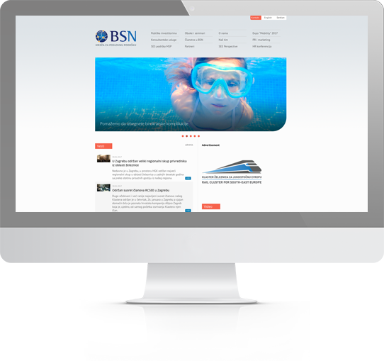
Website design

Design has a classic touch, clear lines, the harmony of colors. Any required information is readily available because we made sure all sections of the website are clearly visible. The theme is inspired by business people who create a network.

January 2015
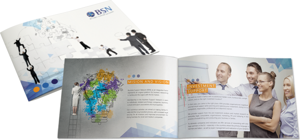
Brochure design

While designing brochures, we wanted to make an impression on the customers. BSN is here to improve your company business. Attractive appearance of the booklets aims to set itself apart from the competition and at the same time contains all the necessary information and details of operations.

November 2014
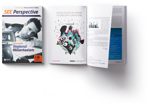
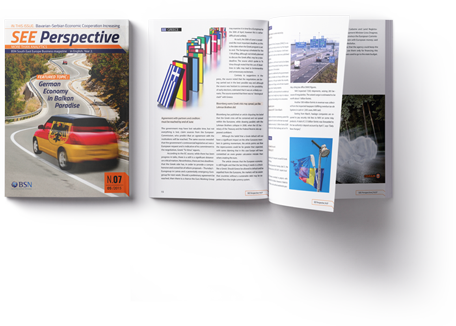
Magazine design

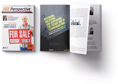
The design of the magazine is important as much as its content. Especially we paid attention to the elements of design because we think it is important that readers will be satisfied with the overall offering.

December 2014
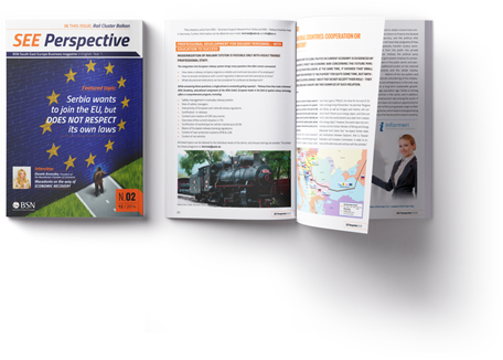
Magazine design

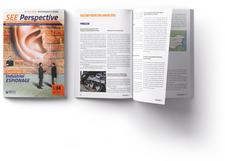
Magazine readers usually notice nice images and powerful headlines, but what is more important is that they feel comfortable when body text is set properly.

January 2015
Magazine design

Our design means that aesthetics and readability are not mutually exclusive.

February 2015
Magazine design

Color is a powerful tool. For this edition we used it moderately because sometimes less is more.

March 2015
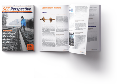
Magazine design

The focus remains on clearly presented content, with images following texts. Elements of design are in harmony.

April 2015
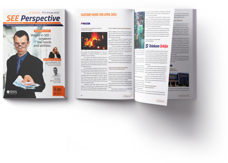
Magazine design

In this edition of the magazine, we wanted to attract readers with a simple design which accentuates professionalism.

May 2015
Magazine design

As in the past editions, this one also follows a design that fits the theme SEE Perspective. Recognizable cover and content has become visual identity of the magazine that keeps pace with developments in the sphere of business.